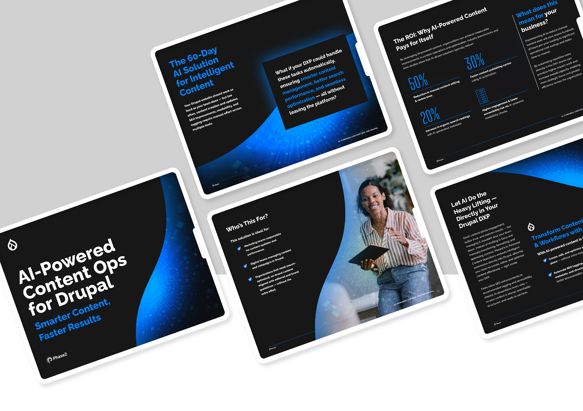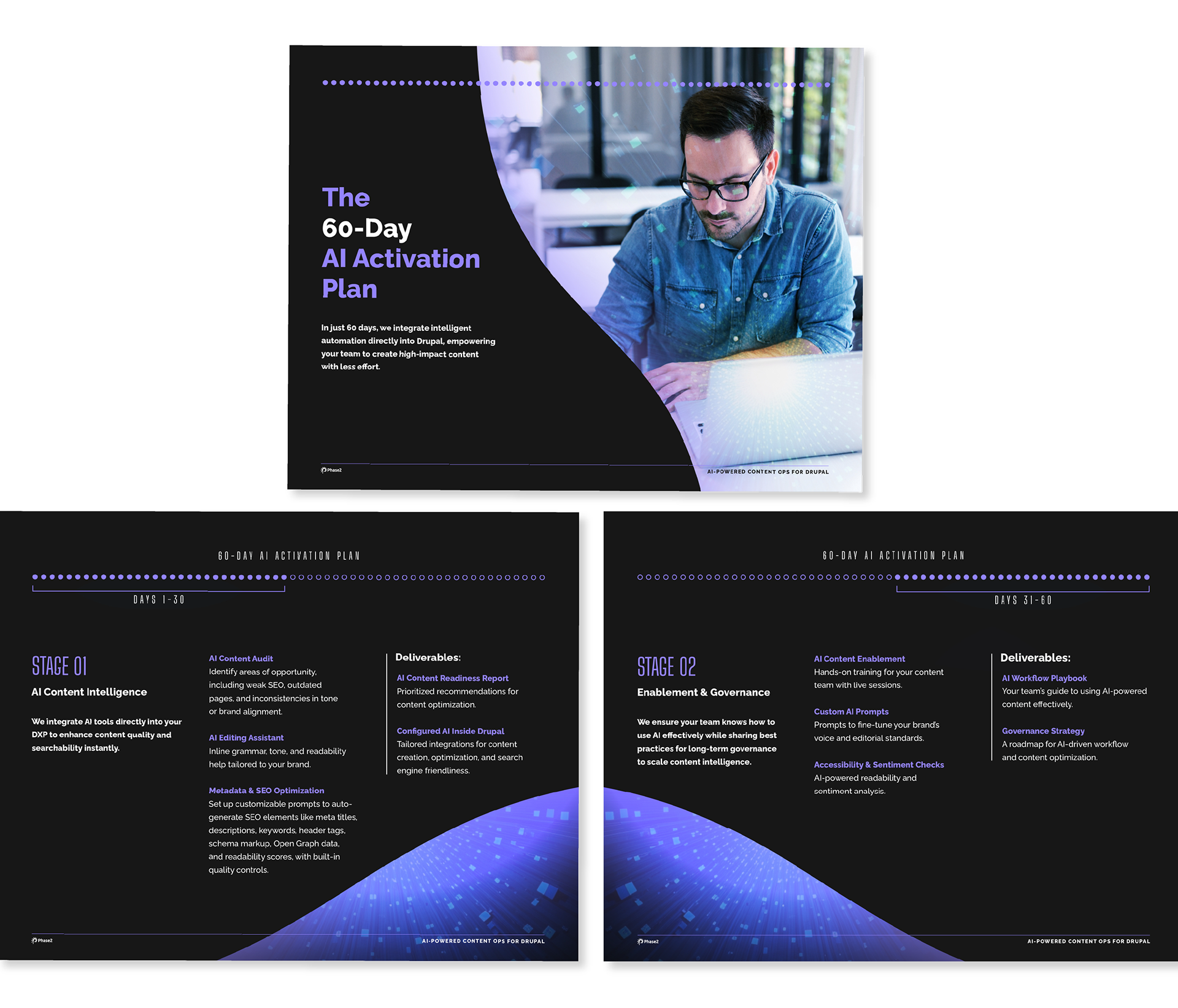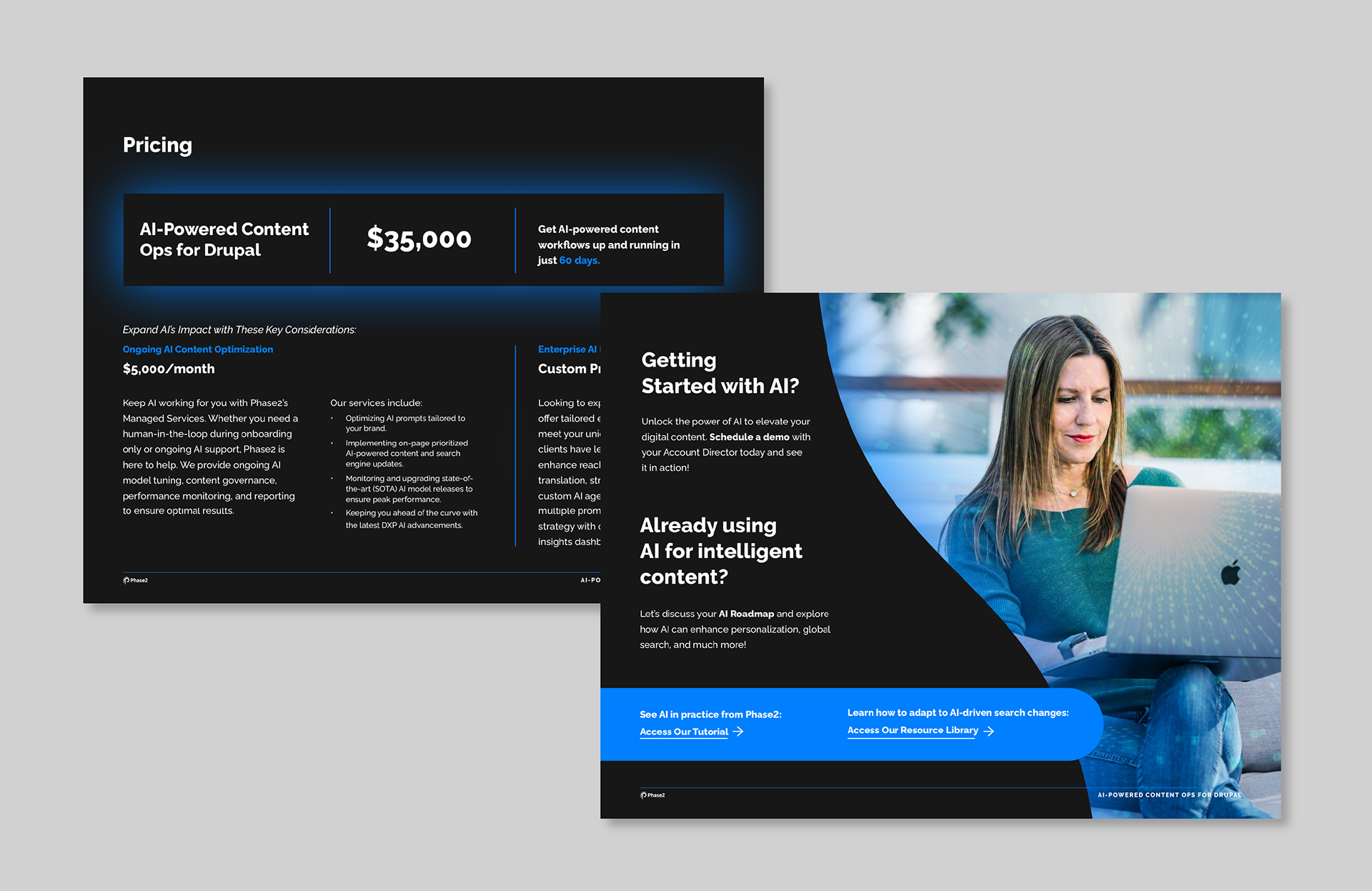
I designed this digital offerings guide in collaboration with a client services team leader at a digital agency, working closely with her to understand the positioning and translate complex information into a visual experience. I didn't write the copy, but the design had to do a lot of the same work: make a technical offering feel sharp, credible, and worth reading.
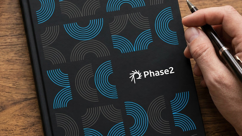
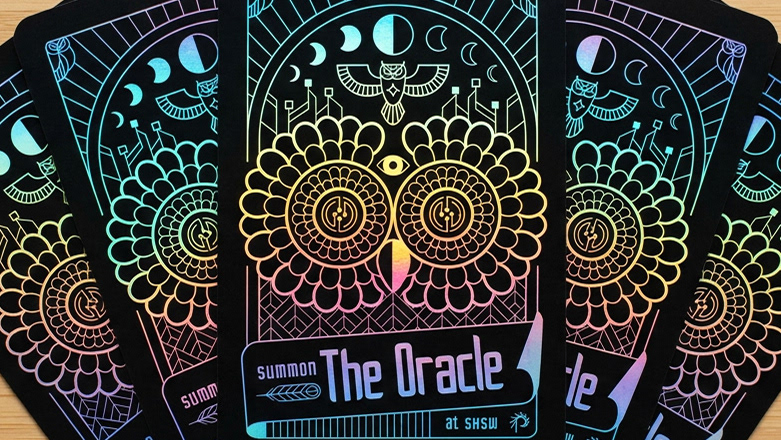
The result pushed the agency's brand into its next chapter, one that signals AI and technical depth without abandoning what made it recognizable. The signature curve, core colors, and brand typography all stayed. What evolved was the energy: darker, more technical, more confident. A natural progression rather than a departure.
The result pushed the agency's brand into its next chapter, one that signals AI and technical depth without abandoning what made it recognizable. The signature curve, core colors, and brand typography all stayed. What evolved was the energy: darker, more technical, more confident. A natural progression rather than a departure.